Art With Edge launched as a new line of coloring experiences by Crayola in 2016, targeting a demographic between your typical child up to adults. It included ‘edgier’ coloring content inspired by themes like graffiti, zombies, and the type of memes you might find on a sweet graphic tee. It was then expanded to licensed properties that play to the nostalgia of those between 20-40 years old. As the lead for this project, I designed and established the logo, brand identity, style guide and also created some of the original content illustrations.
Working with Fegley’s Brew Works, I’ve gotten to illustrate and design a variety of products from beer labels, t-shirts, gift cards, and the annual Musikfest cups, as well as images for social media platforms like Facebook and Untappd. More to come!
Summit Math is a series of math books written by Alex Joujan. He tasked me with reimagining what his books and logo might look like to appeal to both teachers and students. The result was a much more lively and energetic template in which each subsequent book in the series follows the colors of the rainbow. This served a dual purpose — 1. it functionally was a way to keep your books organized and 2. it showed that math concepts, like colors, shift as you dive deeper into your journey with it.
Please support Alex at Summit Math.
During my time on the Crayola Outdoor platform as the lead designer, I updated the graphic look of the logos and packaging graphics within the Sidewalk Chalk line to further showcase the energy of the active outdoor play pattern and washability, re-branded Outdoor Colored Bubbles to push the character and color equity, and developed Outdoor Colorfoam branding and characters. I established the internal style guide for the entire Outdoor platform including Sidewalk Chalk, Sidewalk Paint, Colored Bubbles, and Outdoor Colorfoam product lines. Through this diverse portfolio of products I worked on an array of different types of packaging structures from closed boxes, window boxes, bottle labels, litho graphics, and merchandising displays.
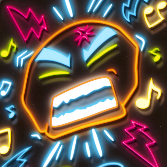
Neon 3D Sidewalk Chalk, 2016 AWARD WINNER: Parents' Choice Awards, Fun Stuff Award; Tillywig Award Winner, Best Creative Fun
Sidewalk Chalk Mega Pack, 2015 AWARD WINNER: Tillywig Award Winner, Top Fun
Chalk Grab ‘N Go Games, 2014 AWARD WINNER: Tillywig Award Winner, Best Family Fun
Outdoor Colorfoam, 2015 AWARD WINNER: Tillywig Award Winner, Sterling Fun
Had the privilege of illustrating the back panels of various playsets for My Little Pony to enhance the imaginative play aspect of these offerings.
Various Crayola Scribble Scrubbie illustrations done for different playsets.
This is a personal passion project. A logo study that started with just the league logo which adorns the championship trophy and then later encompassed all 12 team logos based on a wide range of puns, inside jokes and NSFW shenanigans amongst friends. Once complete, I used it as a jumping off point to learn After Effects and create this hype video. Enjoy.
As the lead designer on the Crayola Paint platform, I was tasked with re-branding the entire portfolio to be more modern and cohesive using color segmentation and subtle tweaks to the logos when applicable to show that the product is different while staying within the branding set forth. For example, designing logos for Washable Watercolors and Educational Watercolors vs. the Washable Paint line, the logos needed to feel similar in their approach, but different enough so the consumer can easily recognize the difference. Likewise the Acrylic Paint & Pumpkin Paint products which were aimed at an older, more craft based demographic needed to feel like they were cousins in the larger family of products.
Spill-Proof Washable Paint, 2021 AWARD WINNER: Tillywig Award Winner, Best Creative Fun; Mom’s Choice Award, Gold; NPPA Winner
Emery Distributors Inc, which specializes in the distribution of model trains and other hobbyist model kits initially tasked me with a logo re-design to help modernize their brand identity. After some sketching and discussions, we determined that the original logo had qualities about it at its core that spoke to their roots as a company. The result was a refreshed modernization of the original logo rather than a complete overhaul. The colors, text, and shape of the logo are intentional; meant to invoke the type of design you might see on the side of a steam engine. An accompanying ad was also created for publication in hobbyist magazines.
IdentiTees, logo & business card design. Business cards are set at a vertical orientation and include rounded corners and a custom diecut on the top to make the card appear as though it’s a mini folded shirt.
Launching Holiday ‘23, Crayola Wixels focuses on creating pixel art through washable marker ink wicking boards. For this project I developed the brand identity, logo, package graphics, instructions, and color guides.
Wixels, 2023 AWARD WINNER: National Parenting Product Awards; Mom’s Choice Awards; The Toy Insider: Top Holiday Toys; Parents’ Pick Awards: Best Products for Elementary Kids
Social media posts created for Power Rangers using brand assets and style guide reference for the upcoming Dino Fury series.
Launched in 2020, Crayola Makers focuses on providing a truly hands on experience making your creative outputs. For this project, I developed the brand identity, logos, style guide, and additional collateral including custom marker labels, instructions, and a color guide. The products were then localized for the EMEA and international markets which wanted a slightly different graphic treatment with a 4L primary package and 9L legal information.
MARKER MAKER, 2020 AWARD WINNER: PAL Award 2020 Winner; 2020 Seal of Approval from the National Parenting Center; Popular Mechanics Game and Toy Awards 2020: Best Toys for Kids
PAPER MAKER, 2020 AWARD WINNER: PAL Award 2020 Winner; Toy Insider, 2020 TOP HOLIDAY Winner; Tillywig Toy Awards 2020, Best Creative Fun; Mom’s Choice Awards 2020; National Parenting Product Awards: 2020 NAPPA Award
Crayola Craft was a new product line of activity kits that launched in 2020 that encompassed various mixed media such as Model Magic, Air-Dry Clay, and paint aimed at the aptly named crafter demographic. As the lead designer, I established the logo, brand identity, and style guide and executed it across the entire line of launch items.
T-shirt illustration done for Robin Hood Brewing Co.
A conceptual and respectful modernization of the iconic logo and branding of my alma mater the Easton Red Rovers.
Logo designed for local cycling coach, Matt Winkler. For this project, Matt was looking for something that would draw inspiration from his heritage in the Belgium flag and a coat of arms.
Icon and brand logo design for an up and coming apparel company.
Check them out at Beyond the Sea
Crayola had a big year with their 2016 Holiday Toy Drivers with Crayon Factory, Emoji Maker, and Color Spinout all being recipients of awards. For these projects I designed the packaging, instruction sheets, and other internal graphics as well as attended and directed the photo shoot for all lifestyle photography.
CRAYON FACTORY, 2016 AWARD WINNER: Play on Words, 2016 PAL Awards; Parents' Choice Awards, Fun Stuff Award; National Parenting Products Award Winner; Toy Insider, Top Holiday Toy; Tillywig, Top Fun Award; Scholastic Parent & Child, Gold Star Award; Mom's Choice Awards, Silver Award
EMOJI MAKER, 2016 Award Winner: Play on Words, 2016 PAL Awards; Toy Insider, Top Holiday Toy; Tillywig, Top Fun Award; National Parenting Products Award Winner; Marriah Media, Gold Award; Santa Choice, Santa Choice Award; The National Parenting Center, Seal of Approval; Parents' Choice Award, Fun Stuff Award; Mom's Choice Awards, Gold Award; Savvy Auntie, Coolest Toy Award
COLOR SPINOUT, 2016 AWARD WINNER: National Parenting Products Award Winner; Marriah Media, Gold Award; Parents Magazine, Best Toys of 2016; Tillywig, Best Creative Fun; Santa Choice, Santa Choice Award
The Crayola Light Designers line's main objective was to unify new, existing, and redesigned products under one look with the basis that all of the products have a light up feature. As the lead, I created the branding, packaging, and instructions for this launch / re-launch.
Logos done for Crayola’s internal Diversity + Inclusion initiatives.
Digital illustration. A work-in-progress personal project I've been working on to capture all of Nintendo's Super Smash Bros. characters in one giant battle.
All characters are © Nintendo / HAL Laboratory, Inc. / Pokémon / Creatures Inc. / GAME FREAK inc. / INTELLIGENT SYSTEMS / SEGA.
As the lead on this project, I designed the packaging & branding, and provided direction on the shots needed for photography. We used a neon PANTONE in the printing process to make the product and various elements be disruptive on shelf while showcasing it’s glow on a dark background.
Glow Art Studio, 2022 AWARD WINNER: Good House Keeping Awards, Best Toy; Tillywig Award Winner, Top Fun; NPPA Winner; Mom’s Choice Awards, Gold
A digital illustration collaboration. Drawing and ink by the extremely talented Luis Perez with colors by yours truly. Digitally painted in Photoshop.
Create 2 Destroy focused on building landscapes out of Morphix and smashing them back down with dinosaurs and catapults. For this project I art directed the photoshoot for the lifestyle and package graphics and worked with an outside designer on some of the initial product renderings.
For this project I was tasked with adapting the Take Note essence and branding to accommodate the addition of Dry-Erase markers into the product line. Here I established it’s own unique look that went across multiple items including several 2-color packages and designing the barrel art for the markers.
Logo and apparel design created for a local volleyball team.
Illustration created for a local running club t-shirt.
Color Alive is a coloring experience that maps pages you color to a 3D model that you can then use to interact with via the AR in the Color Alive app. While working on this project, I was tasked with reworking the original branding and redesigning the layout and color scheme so it had more visual energy along with setting itself apart from the rest of Crayola’s vast portfolio.
Color Alive Avengers & Frozen, 2016 AWARD WINNER: Tillywig Award Winner, Best Creative Fun
A conceptual institutional ad for Kellogg's featuring some of their flagship characters to make sure your kids get off to a good start in the morning by eating breakfast.
All characters are property of Kellogg's®
This poster was created during Kutztown University's annual Designathon in which students are tasked with helping various non-profit clients create and produce any and all collateral they need in a 24hr time frame.
Play Yourself is a production about a once famous movie actress who feels like she is constantly living in the shadows of the characters she portrays.
This poster was created during Kutztown University's annual Designathon in which students are tasked with helping various non-profit clients create and produce any and all collateral they need in a 24hr time frame.
Sleep Out Reach Out was an event to raise money and help support families and individuals in need.
Conceptual ads created for the World Wildlife Fund. Created by using India ink.
26.2 is a conceptual magazine design and layout geared towards marathon runners.
Pencil drawing.